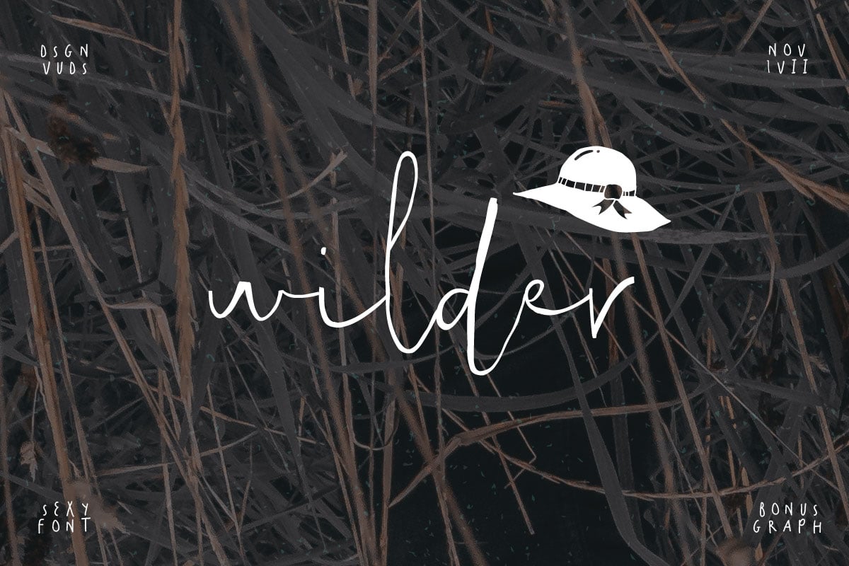


Kamoi Sans – A Geometric Sans
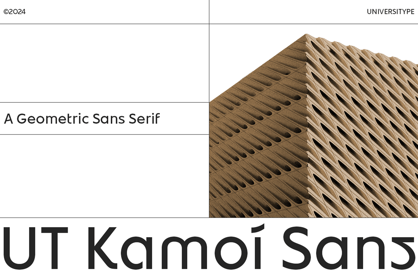
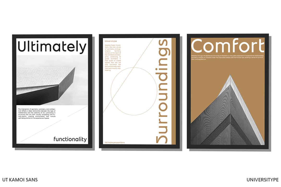
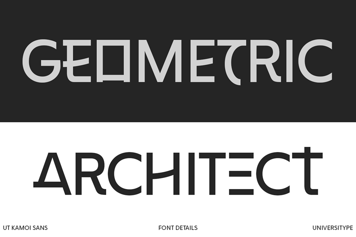
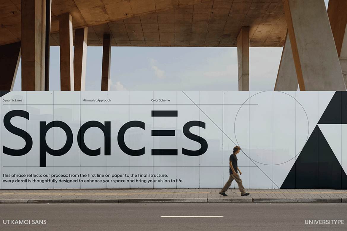
Kamoi Sans is a geometric sans serif font that combines the precision of modern design with the rich cultural heritage of Japanese aesthetics. Drawing inspiration from the smooth curves of Hiragana and Katakana scripts, as well as the meticulous symmetry found in architectural floor plans, this typeface strikes a harmonious balance between artistry and functionality.
Inspiration Behind the Design Kamoi Sans :
Kamoi Sans draws from two distinct yet complementary influences: the graceful curves of Japanese Hiragana and Katakana scripts and the structured precision of architectural floor plans.
Hiragana and Katakana, essential components of the Japanese writing system, are known for their simplicity and elegance.
Each stroke flows with a natural rhythm, offering clarity without rigidity. In contrast, architectural floor plans embody order and structure, where every line is intentional and every angle is carefully considered.
This blend of inspirations results in a typeface that feels both organic and mechanical, soft yet robust. It honors tradition while embracing the modern era.
Key Features:
- Versatility: Ideal for both digital and print applications, ranging from sleek branding projects to captivating editorial layouts.
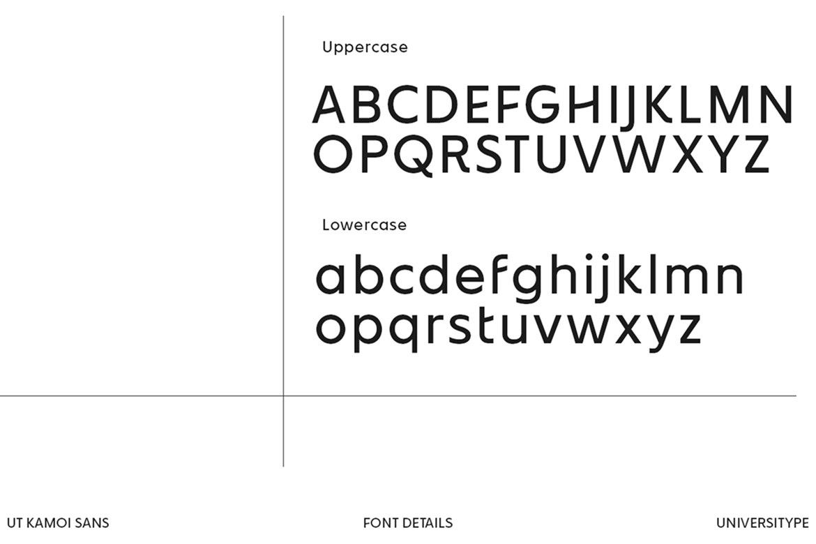
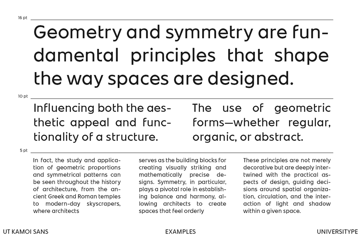
- Legibility: Despite its geometric design, Kamoi Sans offers outstanding readability across various sizes.
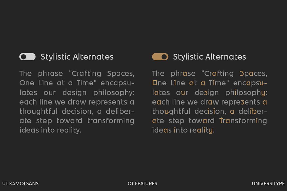
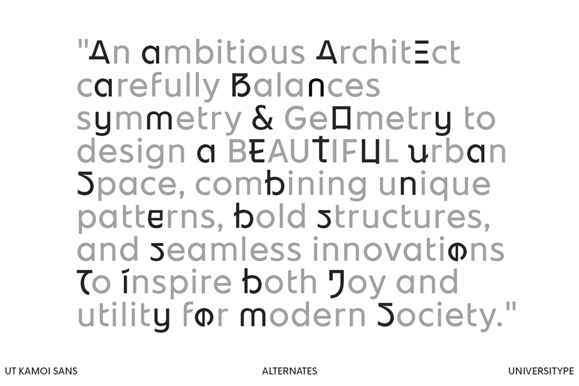
- Unique Attributes: With alternate characters, stylistic options, and ligatures, this font provides limitless creative opportunities, allowing for customization to match diverse brand identities.
What’s Included
- Format : OTF, TTF, WOFF
- 400+ Glyphs
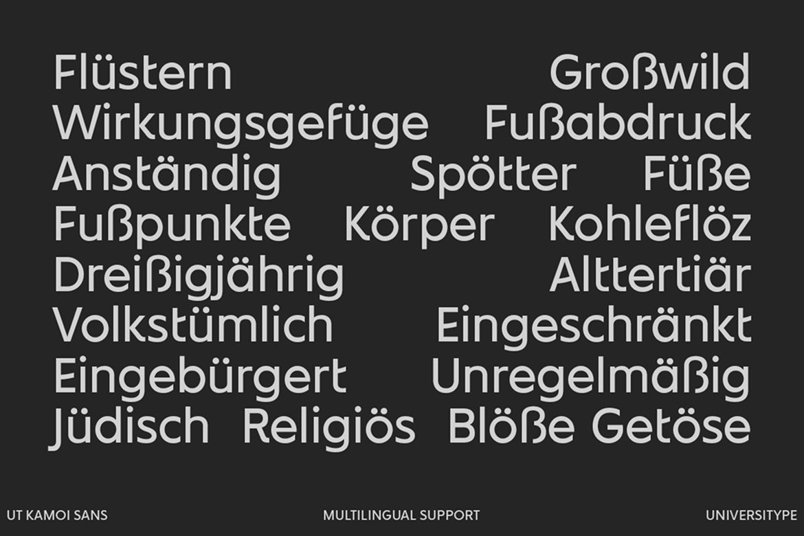
- Multilingual Support for 200+ Languages